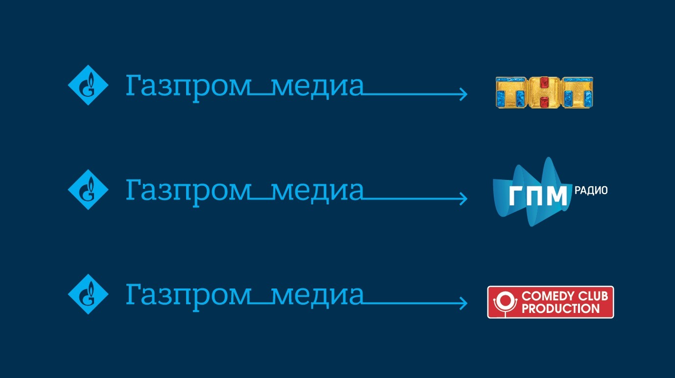
Gazprom-Media, the
leading diversified media holding in Russia and Eastern Europe, presented its
updated logo and corporate style. The brand renewal is linked to the major
changes that took place in the company.
“Over the past few years, the holding has come a long way and reached a new level in all aspects of business. We expanded the brands portfolio and entered new segments, expanded the production of domestic content and its distribution, including to international markets. Thanks to a maximum synergy between assets, the company strengthened its positions on the market and became more attractive to clients and partners. A new visual style became the external reflection of these large-scale changes and values of the company,” said Dmitry Chernyshenko, CEO of Gazprom-Media Holding.
The work on the creation of an updated brand lasted for about a year with BBDO Branding taking the lead in carrying out the project.
“The task before us was to visually reflect the new level of the media holding’s development, offering various options for the brand’s renewed image. The basis of the concept were the core values of the company: its team, creativity, synergy, leadership. Thanks to the redesign, the logo has become more emotional, modern and technological, all the while maintaining links to the original Gazprom symbol,” said Olga Konovalova, general manager of BBDO Branding.
The individual elements of the logo form a single, dynamic construction. The hyphen in “Gazprom-Media” has transformed into an unbreakable link between the two words, which characterizes the synergy of the holding’s businesses. The arrow in the logo symbolizes leadership, continuous development and the large scale of the company’s activity. The corporate sign shows variability: the length and bend of the arrow can differ, which symbolizes art and creativity.
The signature colours of the brand also changed: the dark blue colour is adjusted to a lighter one, while the main font and sign became bright blue. Moreover, the palette of the base colours was supplemented with shades of orange, green and purple, which expands the possibilities of visual design.
